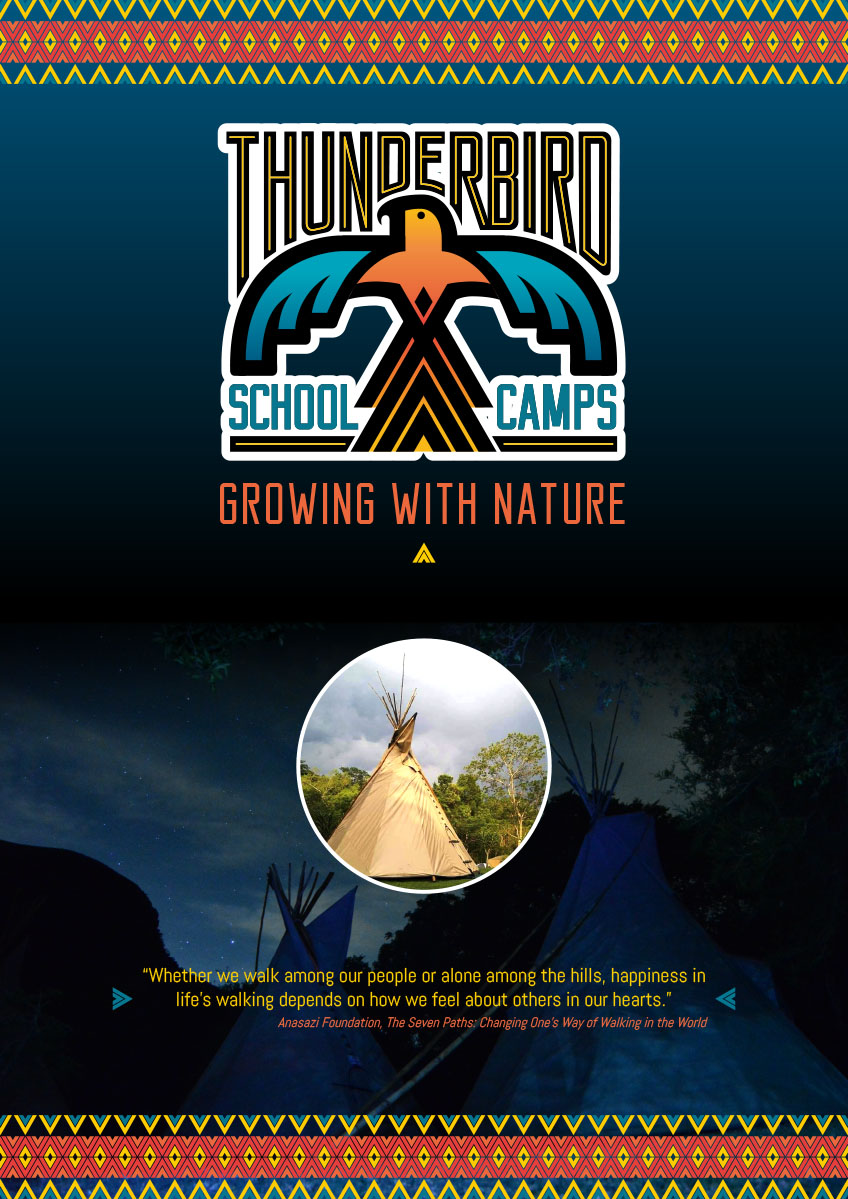
Taking inspiration from its Native American roots.
Youthful themes, established iconography and warmth.
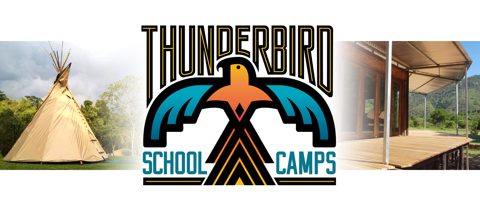
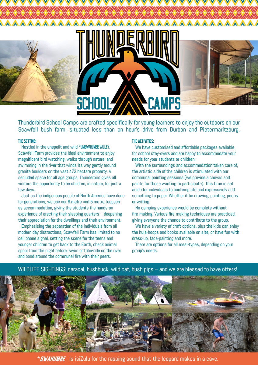
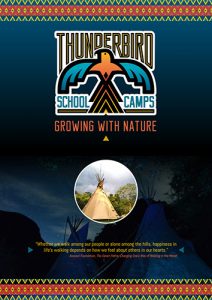
We were asked to design a logo and pamphlet for a campsite, Thunderbird School Camps, themed around Native American iconography and their facilities featuring teepees.
Using the iconography and mythology of the thunderbird, we looked at existing folklore, symbology and colours for inspiration.
ICONOGRAPHY: With the female aspect prominent with the thunderbird, when we looked at the outstretched wings we curved them down (rather than out and up) as protecting elements, and rather than hard and angular we used curved, softer lines. Next, the X symbol has been used through the centuries in the thunderbird iconography – rather than repeating existing square representations, we elongated it when we realised the similarity with the teepee icon.
COLOURING: referencing colours used in fabrics, we chose swatches that had a warmth and richness to them. The reds and yellows providing a sunset warmth, while the blue reflecting the waters and turquoises of Native American designs and jewellery.
We wanted the lettering (particularly “Thunderbird”) to be integrated into the bird itself, so we customised the font around the head and shoulders (with a pinstripe for added colour).
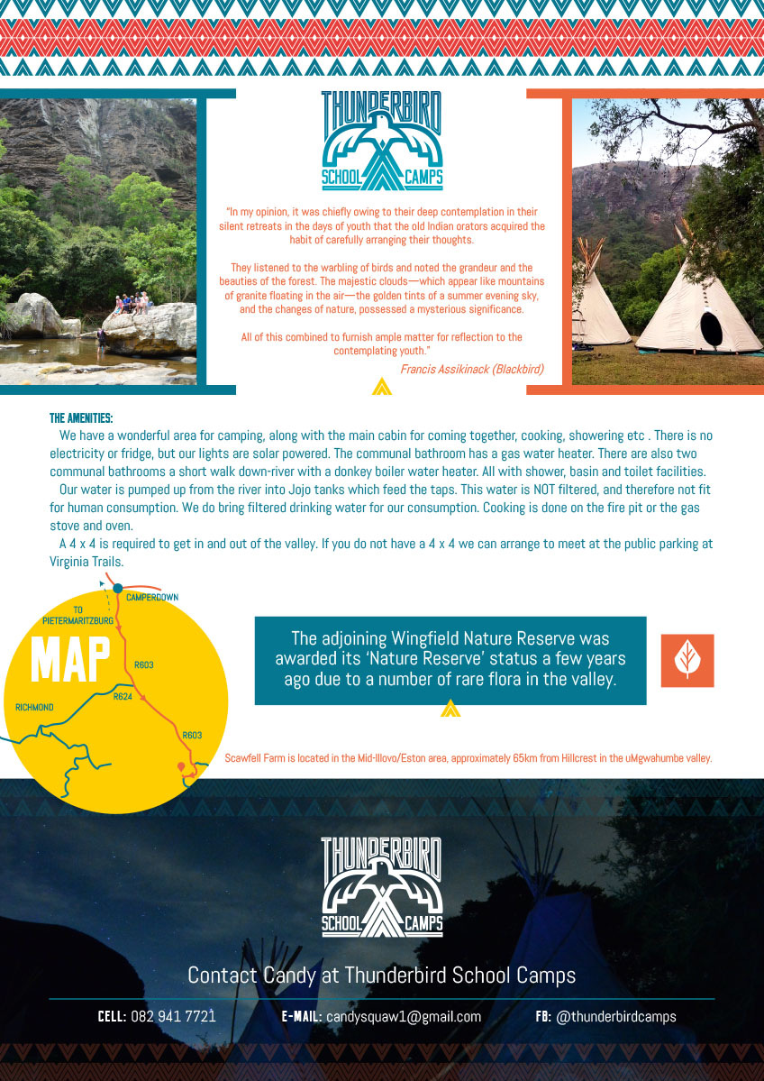
THE PAMPHLET: Taking the Native American designs further, we took the teepee element and created a step-repeat pattern with the existing colours.